Attention: Here be dragons
This is the latest
(unstable) version of this documentation, which may document features
not available in or compatible with released stable versions of Redot.
Checking the stable version of the documentation...
Introduction to GUI skinning
It is essential for a game to provide clear, informative, and yet visually pleasing user interface to its players. While Control nodes come with a decently functional look out of the box, there is always room for uniqueness and case-specific tuning. For this purpose Redot engine includes a system for GUI skinning (or theming), which allows you to customize the look of every control in your user interface, including your custom controls.
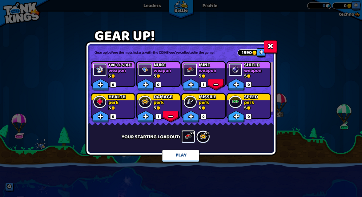
Here is an example of this system in action — a game with the GUI that is radically different from the default UI theme of the engine:

A "Gear Up!" screen in Tank Kings, courtesy of Winterpixel Games
Beyond achieving a unique look for your game, this system also enables developers to provide customization options to the end users, including accessibility settings. UI themes are applied in a cascading manner (i.e. they propagate from parent controls to their children), which means that font settings or adjustments for colorblind users can be applied in a single place and affect the entire UI tree. Of course this system can also be used for gameplay purposes: your hero-based game can change its style for the selected player character, or you can give different flavors to the sides in your team-based project.
Basics of themes
The skinning system is driven by the Theme resource. Every Redot project has an inherent default theme that contains the settings used by the built-in control nodes. This is what gives the controls their distinct look out of the box. A theme only describes the configuration, however, and it is still the job of each individual control to use that configuration in the way it requires to display itself. This is important to remember when implementing your own custom controls.
Note
Even the Redot editor itself relies on the default theme. But it doesn't look the same as a Redot project, because it applies its own heavily customized theme on top of the default one. In principle, this works exactly like it would in your game as explained below.
Theme items
The configuration that is stored in a theme consists of theme items. Each item has a unique name and must be one of the following data types:
Color
A color value, which is often used for fonts and backgrounds. Colors can also be used for modulation of controls and icons.
Constant
An integer value, which can be used either for numeric properties of controls (such as the item separation in a BoxContainer), or for boolean flags (such as the drawing of relationship lines in a Tree).
Font
A font resource, which is used by controls that display text. Fonts contain most text rendering settings, except for its size and color. On top of that, alignment and text direction are controlled by individual controls.
Font size
An integer value, which is used alongside a font to determine the size at which the text should be displayed.
Icon
A texture resource, which is normally used to display an icon (on a Button, for example).
StyleBox
A StyleBox resource, a collection of configuration options which define the way a UI panel should be displayed. This is not limited to the Panel control, as styleboxes are used by many controls for their backgrounds and overlays.
Theme types
To help with the organization of its items each theme is separated into types,
and each item must belong to a single type. In other words, each theme item
is defined by its name, its data type and its theme type. This combination
must be unique within the theme. For example, there cannot be two color items named
font_color in a type called Label, but there can be another font_color
item in a type LineEdit.
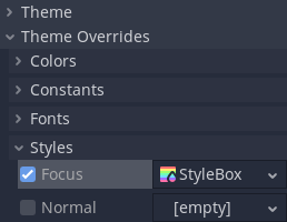
The default Redot theme comes with multiple theme types already defined, one for every built-in control node that uses UI skinning. The example above contains actual theme items present in the default theme. You can refer to the Theme Properties section in the class reference for each control to see which items are available to it and its child classes.
Note
Child classes can use theme items defined for their parent class (Button
and its derivatives being a good example of that). In fact, every control can
use every theme item of any theme type, if it needs to (but for the clarity and
predictability we try to avoid that in the engine).
It is important to remember that for child classes that process is automated.
Whenever a built-in control requests a theme item from the theme it can omit
the theme type, and its class name will be used instead. On top of that,
the class names of its parent classes will also be used in turn. This allows
changes to the parent class, such as Button, to affect all derived
classes without the need to customize every one of them.
You can also define your own theme types, and additionally customize both built-in controls and your own controls. Because built-in controls have no knowledge of your custom theme types, you must utilize scripts to access those items. All control nodes have several methods that allow to fetch theme items from the theme that is applied to them. Those methods accept the theme type as one of the arguments.
var accent_color = get_theme_color("accent_color", "MyType")
label.add_color_override("font_color", accent_color)
Color accentColor = GetThemeColor("accent_color", "MyType");
label.AddColorOverride("font_color", accentColor);
To give more customization opportunities types can also be linked together as
type variations. This is another use-case for custom theme types. For example,
a theme can contain a type Header which can be marked as a variation of
the base Label type. An individual Label control can then be set to
use the Header variation for its type, and every time a theme item is
requested from a theme this variation will be used before any other type. This
allows to store various presets of theme items for the same class of the
control node in the single Theme resource.
Warning
Only variations available from the default theme or defined in the custom project theme are shown in the Inspector dock as options. You can still input manually the name of a variation that is defined outside of those two places, but it is recommended to keep all variations to the project theme.
You can learn more about creating and using theme type variations in a dedicated article.
Customizing a control
Each control node can be customized directly without the use of themes. This is called local overrides. Every theme property from the control's class reference can be overridden directly on the control itself, using either the Inspector dock, or scripts. This allows to make granular changes to a particular part of the UI, while not affecting anything else in the project, including this control's children.

Local overrides are less useful for the visual flair of your user interface, especially if you aim for consistency. However, for layout nodes these are essential. Nodes such as BoxContainer and GridContainer use theme constants for defining separation between their children, and MarginContainer stores its customizable margins in its theme items.
Whenever a control has a local theme item override, this is the value that it uses. Values provided by the theme are ignored.
Customizing a project
Out of the box each project adopts the default project theme provided by Redot. The default theme itself is constant and cannot be changed, but its items can be overridden with a custom theme. Custom themes can be applied in two ways: as a project setting, and as a node property throughout the tree of control nodes.
There are two project settings that can be adjusted to affect your entire project: gui/theme/custom allows you to set a custom project-wide theme, and gui/theme/custom_font does the same to the default fallback font. When a theme item is requested by a control node the custom project theme, if present, is checked first. Only if it doesn't have the item the default theme is checked.
This allows you to configure the default look of every Redot control with a single theme resource, but you can go more granular than that. Every control node also has a theme property, which allows you to set a custom theme for the branch of nodes starting with that control. This means that the control and all of its children, and their children in turn, would first check that custom theme resource before falling back on the project and the default themes.
Note
Instead of changing the project setting you can set the custom theme resource to the root-most control node of your entire UI branch to almost the same effect. While in the running project it will behave as expected, individual scenes will still display using the default theme when previewing or running them directly. To fix that you can set the same theme resource to the root control of each individual scene.
For example, you can have a certain style for buttons in your project theme, but want a different look for buttons inside of a popup dialog. You can set a custom theme resource to the root control of your popup and define a different style for buttons within that resource. As long as the chain of control nodes between the root of the popup and the buttons is uninterrupted, those buttons will use the styles defined in the theme resource that is closest to them. All other controls will still be styled using the project-wide theme and the default theme styles.
To sum it up, for an arbitrary control its theme item lookup would look something like this:
Check for local overrides of the same data type and name.
Using control's type variation, class name and parent class names:
Check every control starting from itself and see if it has a theme property set;
If it does, check that theme for the matching item of the same name, data and theme type;
If there is no custom theme or it doesn't have the item, move to the parent control;
Repeat steps a-c. until the root of the tree is reached, or a non-control node is reached.
Using control's type variation, class name and parent class names check the project-wide theme, if it's present.
Using control's type variation, class name and parent class names check the default theme.
Even if the item doesn't exist in any theme, a corresponding default value for that data type will be returned.
Beyond controls
Naturally, themes are an ideal type of resource for storing configuration for something visual. While the support for theming is built into control nodes, other nodes can use them as well, just like any other resource.
An example of using themes for something beyond controls can be a modulation of sprites for the same units on different teams in a strategy game. A theme resource can define a collection of colors, and sprites (with a help from scripts) can use those colors to draw the texture. The main benefit being that you could make different themes using the same theme items for red, blue, and green teams, and swap them with a single resource change.